


Behind the scenes: Ship Models at Sweden’s Maritime Museum
Explore the behind the scenes process of filming the Argentina, a 'votive', the Aeolus and the East Indiaman ship models at the National Maritime Museum, Sweden.
This page is approximately a 5 minute read
Anna Grybenyuk, Researcher
Anna Grybenyuk graduated from the University of St Andrews with a degree in Modern History and Russian in 2016, then again with an MLitt in Museum and Gallery Studies in 2020. Much of her knowledge of fishing and maritime activity comes from working at the Scottish Fisheries Museum, and from living so long by the coast. She currently works in Oxford, managing digital collections for the Pitt Rivers Museum and History of Science Museum. It is far from the sea, but she will take any opportunity to head back to the coast to spot birds and boats alike.
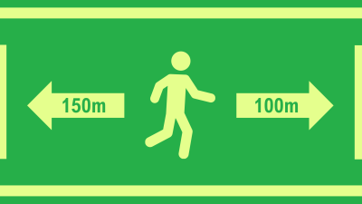
Safety signage is everywhere, including aboard ships. It can seem ever-present in our lives, so most people do not pay much attention to it. However, in an emergency, safety signage can make the difference between life and death. This is especially true on a large ship like a cruise ship where there are many passengers who may not all speak the same language. If something goes wrong, people need to be guided about what to do. On other ships, such as cargo or fishing boats, such signage exists to warn crew of potential danger so they do not get hurt or killed. Whatever the vessel, the signs all share similar if not the same design principles.
SOLAS, the (Safety of Life at Sea) Convention, strictly governs signage for fire, escape, or emergency equipment, to name but a few. IMO (International Maritime Organization) adopted Resolution A. 1116(30) in December 20171 to update these provisions, aligning it with the International Organization for Standardization’s ISO 24409. What most people overlook is tightly regulated, and has saved lives in the past.
As governed by the IMO and ISO ISO 7010 and 244092, there are six different categories of signs, each denoting a different function. First, there are green signs for life-saving, such as indicating where life jackets or muster stations are. Next are red fire-fighting signs, for example indicating fire extinguishers. Then there are blue signs that mandate actions like wearing hearing protection. Another type are circular red and white prohibitions, the classic of which is a no smoking sign. Finally there are yellow signs indicating hazards like flammable materials or toxins3. These are not limited to ships, but are common in many public spaces and workplaces on land, making them even more recognisable to the layman. The height and size of signs are also regulated and are directly proportional to one another. Illumination is also dictated to can be seen in any dark area or at any time of night4. All of this serves to make sure the signs are visible and as recognisable as possible.
Safety signage is most critical for large passenger ships such as ferries and cruise ships due to the presence of a lot of untrained people, with little to no knowledge of the ship. They need clear, unambiguous instructions in case of an emergency. This was a lesson that was learned from the 2012 Costa Concordia disaster, which forced a re-examination and subsequent standardisation of escape route markings and emergency signage5. Both language difficulties and the lack of familiarity the passengers had with escape routes were cited as reasons for the poor evacuation6. This was something that the improved signage standards aimed to tackle by being clear and consistent in conveying their messages.
To further complicate things, cruise ship passengers tend to be a diverse group of people, with varying ages and ability levels that may affect mobility or sight. Signage relies on visuals, and factors like distance, obstructions, smoke, or people’s inherent ability to see, can all impact how much signage is required, what types, and where7. Additionally, signs need to be prominent enough so passengers are aware of them and can familiarise themselves even before a disaster strikes. Clear, visible signage forms a vital part of the ship’s overall safety system in guiding passenger behaviour during an emergency8. Therefore, it is not something that should be neglected. Instead signage must be carefully considered, the same as lifeboats and life jackets.
Safety signage must remain easily accessible and understandable by as many people as possible. Some signage manufacturers have shown interest in digital signage and have argued that they may be useful due to being able to display multiple things in different languages, and adjust the display as needed9. However, the IMO currently does not accept digital signs as compliant, due to the obvious issues of powering them in a crisis when they are needed most10. Digital signage may also not be as effective in conveying its vital message when related to people’s age or sensitivity to flashing images. Signage should not exacerbate stress in an already stressful situation11. To cope with power outages, photoluminescent signs which emit light that they absorbed during the day or when lights were on, are the standard option12. If digital signage is to be integrated, it must not be a replacement but an enhancement.
As with all things, maritime signage does deteriorate and become less effective over time. UV, salt, radiation, and moisture all play a part in wearing down a sign, making them less colourful and thus harder to distinguish at a glance. Replacing them has no timeline, but is instead dependant on whether they still serve their purpose by being legible, visible, and effective in an emergency13. Durability is therefore one of the top priorities for considering what materials they are made out of; the more durable the sign, the longer it can continue to serve its purpose without compromising safety. Because of the conditions at sea, maritime signage is required to be made out of more durable material than regular safety signage on land14. At the same time, environmental sustainability has also come under scrutiny. PVC used to be the material of choice for safety signage, but increasingly, the industry is moving away from this as PVC contains halogens, which makes the material toxic when heated and more difficult to recycle15. Even signage, despite seeming small and unimportant, has a role to play in reducing environmental impact.
Unlike a lifeboat or life jacket, there is very little glamour to safety signage. Many glance at it and only subconsciously register its meaning. Yet in an emergency, it has been shown to be vital to saving lives. With careful design, safety signs are unobtrusive but there when you need them. It is worth taking a second to appreciate and to study, even just to be familiar with whatever the signs are trying to say. They are always there for a reason.
International Maritime Organization. “Resolution A.1116(30) Adopted on 5 December 2017. Escape Route Signs and Equipment Location Markings.” International Maritime Organization, wwwcdn.imo.org/localresources/en/KnowledgeCentre/IndexofIMOResolutions/AssemblyDocuments/A.1116(30).pdf. Accessed 8 Dec. 2025.
International Organization for Standardization Ships and Marine Technology — Design, Location and Use of Shipboard Safety Signs, Fire Control Plan Signs, Safety Notices and Safety Markings. ISO 24409-1:2020, www.iso.org/obp/ui/en/#iso:std:iso:24409:-1:ed-2:v1:en.
“IMO Safety Signs – Maritime Standard Signs.” Safety Signs and Notices, www.safetysignsandnotices.co.uk/imo-safety-signs. Accessed 12 July 2026.
“Marine Safety Signs – Design and Installation, Code of Practice in Compliance with ISO 24409.” Everlux Maritime, Aug. 2015, everluxmaritime.com/en/newsletter/everlux-maritime-e-news-4/marine-safety-signs-design-and-installation-code-of-practice-in-compliance-with-iso-24409/.
Maguire, John. “Cruise Ship Disasters: Lessons Learned from Tragic Events.” Cruisedirect, 23 Mar. 2026, www.cruisedirect.com/blog/posts/cruise-ship-disasters-lessons-learned.
Nautilus International. “Costa Concordia Disaster Prompts Changes in Merchant Ship Emergency Signage.” Press Release Point, 21 Nov. 2018, www.pressreleasepoint.com/costa-concordia-disaster-prompts-changes-merchant-ship-emergency-signage. Press release.
Kong, You, et al. “Optimizing Evacuation signage layouts in symmetrical Cruise Ship Theaters Considering Passenger Mobility and Visual Asymmetries.” Symmetry, vol. 17, no. 9, 24 Aug. 2025, p. 1383, https://doi.org/10.3390/sym17091383.
Casareale, Cristina, et al. “Cruise Ships Like Buildings: Wayfinding Solutions to Improve Emergency Evacuation.” Building Simulation, vol. 10, no. 6, 13 June 2017, pp. 989–1003, https://doi.org/10.1007/s12273-017-0381-0.
“Digital vs Traditional Marine Signage – What’s the Future?” Lenco, 30 Apr. 2025, www.lenco.co.uk/news/digital-vs-traditional-marine-signage-whats-the-future/.
“Are Digital Displays Accepted as IMO Safety Signs under Current Regulations?” Signwell, 16 July 2026, signwell.fi/en/are-digital-displays-accepted-as-imo-safety-signs-under-current-regulations/.
Kwee-Meier, Sonja Th., et al. “Age-Related Differences in Decision-Making for Digital Escape Route Signage Under Strenuous Emergency Conditions of Tilted Passenger Ships.” Applied Ergonomics, vol. 59, Mar. 2017, pp. 264–273, https://doi.org/10.1016/j.apergo.2016.09.001.
Smol, Nicky. “Safety Signs Maritime: Guiding Your Way to Safety.” T-ISS, 4 Aug. 2025.
“How Often to Replace Marine Safety Signs? | SOLAS & IMO Guidance.” Marine Lite, 17 Dec. 2025, www.marinelite.gr/news-en/how-often-must-marine-safety-signs-be-replaced/.
“What Is IMO Signage Used for on Ships?” Signwell, 29 Dec. 2025, signwell.fi/en/what-is-imo-signage-used-for-on-ships.
Smol, Nicky. “Why PVC Should Not Be Used in Signage.” T-ISS, 18 Mar. 2025, t-iss.com/2024/03/25/why-pvc-should-not-be-used-in-signage/.
Explore the behind the scenes process of filming the Argentina, a 'votive', the Aeolus and the East Indiaman ship models at the National Maritime Museum, Sweden.
Explore the behind the scenes filming of the Cold War Rail Ferry, Oasis of the Seas, Stena Drillmax and Olympic Loyalty ship models at the IMO's headquarters.
A behind the scenes look at the process of filming HMS Vanguard, HMS Prince, Campania and Océan at the Science Museum's National Collections Centre, Swindon.


